Flutter Widget 101 Part 1 (Basic of Flutters, Layouts, Rows and Columns)
1. What every programme starts with
void main() => runApp(new MyApp());
"=>" is an operator and it denotes { return expr; }.() denotes method
runApp will run MyApp() which is a widget.
Besides running MyApp(), you can also play with runApp() function by doing the following:
new Text(). Do remember to include the TextDirection. Text will appear on the top left hand corner of the screen.
void main() { runApp( new Text('Hello World',textDirection: TextDirection.ltr,)); }Make it centralised in the center through the following.void main() => runApp( new Center( child: new Text('Hello World',textDirection: TextDirection.ltr,) ) );
2.Declaring App/Widget to be run in runApp()
void main() => runApp(MyApp());
class MyApp extends StatelessWidget{
  @override  Widget build(BuildContext context) {
    // TODO: implement build    return null;
  }
}
extends is the inheriting of properties of the library Stateless Widget
-Note you can also runApp (Container(color: Colors.red));
-Note you can also runApp (Container(color: Colors.red));
3. Exploring Stateless Widget
Stateless Widget is an object/widget without state
Override the build() method for Widget and return value.
- return newMaterialApp() which have the following
- scaffold
- container
- container within a container
Type Stless to generate the class.
Container within container example:
class MyApp extends StatelessWidget{
  @override  Widget build(BuildContext context) {
    return new MaterialApp(title:"StatelessWidget1",home: new Scaffold(body: new Container(color:Colors.purple, child: new Container(color:Colors.blueAccent, margin: const EdgeInsets.all(30.0),),),));
  }
}
class MyApp extends StatelessWidget{
  @override  Widget build(BuildContext context) {
    return new MaterialApp(
        title:"StatelessWidget1",
        home: new Scaffold(
          body: new Container(
            color:Colors.purple,
            child: new Container(
              color:Colors.blueAccent, margin: const EdgeInsets.all(30.0),
            ),
          ),
        )
    );
  }
}
Custom Widget
Different from example above
- runApp: create new MaterialApp instead of new Application. From new materialApp, directly declare class inside home.
- Custom Widget is declared outside
Custom Class
- Create custom class
- Import custom class in main class
- Use the method() in the custom class
main.dartcustomContainer.dart
class BoxInBox extends StatelessWidget {
  @override  Widget build(BuildContext context) {
    return Container(
      child: new Container(
        color: Colors.purple,
        margin: const EdgeInsets.all(10.0),
        child: new Container(
          color: Colors.blueAccent,
          margin: const EdgeInsets.all(30.0),
        ),
      ),
    );
  }
}
4.Widget hierarchy

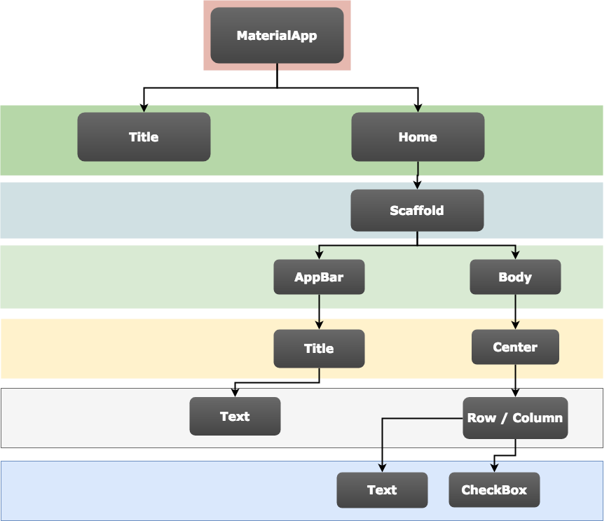
In my interpretation, Application> MaterialApp > Home: Scaffold > Body: Container
A convenience widget that wraps a number of widgets that are commonly required for material design applications. It builds upon a WidgetsApp by adding material-design specific functionality, such as AnimatedTheme and GridPaper.
Scaffold:Implements the basic material design visual layout structure.
Scaffold(
appBar: AppBar(
title: Text('Sample Code'),
),
body: Center(
child: Text('Scaffold'),
),
bottomNavigationBar: BottomAppBar(
child: Container(height: 50.0,),
),
floatingActionButton: FloatingActionButton(
onPressed: () {},
tooltip: 'Increment',
child: Icon(Icons.add),
),
floatingActionButtonLocation: FloatingActionButtonLocation.centerDocked,
)
Container > Margin > Constraints (Width and Height) > Padding > Child
Containers with no children try to be as big as possible
Containers with children size themselves to their children. The width, height, and constraints arguments to the constructor override this.
Height and Width (Square x Square)

In my interpretation, Application> MaterialApp > Home: Scaffold > Body: Container
A convenience widget that wraps a number of widgets that are commonly required for material design applications. It builds upon a WidgetsApp by adding material-design specific functionality, such as AnimatedTheme and GridPaper.
Container > Margin > Constraints (Width and Height) > Padding > Child
Containers with no children try to be as big as possible
Containers with children size themselves to their children. The
Height and Width (Square x Square)
width, height, and constraints arguments to the constructor override this.Height and Width (Square x Square)
5.Stateful Widget
Stateful Widget contain Widget state stored in State Object
State is information that (1) can be read synchronously when the widget is built and (2) might change during the lifetime of the widget. It is the responsibility of the widget implementer to ensure that the State is promptly notified when such state changes, using State.setState.
Type stful for Stateful Widget autocompletion.
initState(): Called once when state object is created.
The difference is (in the context of creating a
State object) which has the initState() method:
constructorsimply create a newStateinstanceinitState()is called after the object is created and at this point you have access to theBuildContextor theStatefulWidgetto which theStateis attached to, respectively using thecontextand thewidgetproperties. At this point theStateis already mounted.
6. Set State for Stateful Widget/ Annoymous Function
setState(): When Developer want to change state of widget.
Anonymous Function: Method ((){}) Used in onPressed()/onTap()
RaisedButton(): Looked raised when Button is raised.
Create onClick method and use it onPressed: (){Define your method here();}
void main() => runApp(MyApp());

class MyApp extends StatefulWidget {
  @override  _MyAppState createState() => _MyAppState();
}

class _MyAppState extends State<MyApp> {

  String buttonText;

  @override  void initState(){
    buttonText = "Martial Shoot";
    super.initState();
  }

  void shoot(){
    setState((){
      buttonText="Martial Score, Gooooaaaalllll!!!";
    });
  }

  @override  Widget build(BuildContext context) {
    return new MaterialApp(
      title: 'Stateful Widget',
      home: new Scaffold(
        body: new Center(
          child: new RaisedButton(onPressed: (){shoot();},child: new Text(buttonText),),
        ),
      ),
    );
  }
}
7 Layout Advance
Different type of layout: https://flutter.io/docs/reference/widgets/layout
Each container can only have 1 background colour, hence either colour in child or decoration.
Usage: To specify padding, background colour or size of item, place it inside a container.
Padding: for specific area use "Edgeinserts.only"
const EdgeInsets.only({ this.left = 0.0, this.top = 0.0, this.right = 0.0, this.bottom = 0.0 });
There will be alignment issue in the middle row. Column will be at the top.
Two type of axis, Main (Long) and Cross (Short)
Row: Main (Horizontal) and Cross (Vertical)
Column: Main (Vertical) and Cross (Horizontal)
Center by inserting mainAxisAlignment: MainAxisAlignment.center,
More on: https://proandroiddev.com/flutter-layout-cheat-sheet-5363348d037e
Challenge: https://proandroiddev.com/getting-your-hands-dirty-with-flutter-basic-animations-6b9f21fa7d17
9. Animation
https://docs.flutter.io/flutter/widgets/Transform-class.html
https://docs.flutter.io/flutter/vector_math_64/Matrix4-class.html
Container:
Define Height and Width, Alignment, Padding, Color, RotationEach container can only have 1 background colour, hence either colour in child or decoration.
Usage: To specify padding, background colour or size of item, place it inside a container.
Padding: for specific area use "Edgeinserts.only"
const EdgeInsets.only({ this.left = 0.0, this.top = 0.0, this.right = 0.0, this.bottom = 0.0 });
void main() => runApp(MyApp());


class MyApp extends StatelessWidget {
  @override  Widget build(BuildContext context) {
    return new MaterialApp(
      home:new Scaffold(
        body: new Container(
          child: new Text("Hello World"),
          //color:pink,          height: 100.0,
            width: 100.0,
          alignment: Alignment.topCenter,
          padding: const EdgeInsets.all(20.0),
          decoration: new BoxDecoration(
            color: Colors.black12          ),
          transform: new Matrix4.rotationZ(0.25),
        ),
      ),
    );
  }
}
Row and Column:
Row (Split Screen Horizontally):
void main() => runApp(MyApp());


class MyApp extends StatelessWidget {
  @override  Widget build(BuildContext context) {
    return new MaterialApp(
      home:new Scaffold(
        appBar: new AppBar(title: new Text("Row Test"),),
        body: new Row(
          children: <Widget>[
            new Text('R1'),
            new Text('R2'),
            new Text('R3'),
          ]
        ),
        ),
      );
  }
}
Column (Split Screen Vertically) within Row:
There will be alignment issue in the middle row. Column will be at the top.
void main() => runApp(MyApp());


class MyApp extends StatelessWidget {
  @override  Widget build(BuildContext context) {
    return new MaterialApp(
      home:new Scaffold(
        appBar: new AppBar(title: new Text("Row Test"),),
        body: new Row(
            //mainAxisAlignment: MainAxisAlignment.center,            children: <Widget>[
            new Text('1'),
            new Column(
               //mainAxisAlignment: MainAxisAlignment.center,                children: <Widget>[
                  new Text('C1'),
                  new Text('C2'),
                  new Text('C3'),
                  ]
            ),
            new Text('3'),
          ]
        ),
        ),
      );
  }
}
Alignment:
Two type of axis, Main (Long) and Cross (Short)
Row: Main (Horizontal) and Cross (Vertical)
Column: Main (Vertical) and Cross (Horizontal)
Center by inserting mainAxisAlignment: MainAxisAlignment.center,
Expanded: Child element inside Row or Column will expand to fill available space
More on: https://proandroiddev.com/flutter-layout-cheat-sheet-5363348d037e
Challenge: https://proandroiddev.com/getting-your-hands-dirty-with-flutter-basic-animations-6b9f21fa7d17
9. Animation
https://docs.flutter.io/flutter/widgets/Transform-class.html
https://docs.flutter.io/flutter/vector_math_64/Matrix4-class.html
Comments
Post a Comment